颜色
primary重要蓝secondary次要灰success成功绿info信息青warning警告黄danger危险红dark深色light浅色
- 文本色
.text-primary.text-danger- ……
- 背景色
.bg-primary.bg-danger- ……
- 文本背景对比色:用于设置背景色,并且把文本色设置成背景色的对比色【黑/白】
.text-bg-primary.text-bg-danger- ……
- 链接色【可以有
:hover,:focus效果】.link-*
- 边框色
.border-primary- ……
文本
- 大小
.fs-*字体大小
- 粗细
.fw-bold粗体.fw-light细体.fw-normal重置文本的字体粗细为默认值
- 线条修饰
.text-decoration-none去除文本装饰【下划线 ……】
- 对齐
.text-left左对齐文本.text-center居中文本.text-end右对齐文本
.text-nowrap文本不换行.text-break让文本换行,防止破坏布局
❤ 框模型
💛 边距
marginm-*上下左右.mx-*/auto左右 margin 都 auto.my-*/auto上下mt-*上me-*右mb-*下ms-*左
paddingp-*上下左右pt-*pe-*pb-*ps-*
💛 边框
no-border无边框
宽度 :
border-0边框宽度为 0
颜色 :
border-primaryborder-primary-subtle浅色的 primary
💛 圆角
- 全周围
.rounded:为元素添加轻微的圆角.rounded-circle:使元素的边框完全变为圆形.rounded-pill:为元素添加较大的圆角,使其看起来像一个药丸形状
- 上下左右
.rounded-top:为元素的顶部添加圆角.rounded-start:为元素的左侧添加圆角.rounded-end:为元素的右侧添加圆角.rounded-bottom:为元素的底部添加圆角
图片/视频
.object-fit-以多种方式填充父容器- 保持宽高比
contain图片适应容器cover图片填满容器none原始尺寸
- 不保持宽高比
fill拉伸图片来填满
scale
- 保持宽高比
❤ 阴影
shadow-none无阴影shadow-sm少量阴影shadow常规阴影shadow-lg大量阴影
html
<div class="shadow-none p-3 mb-5 bg-body-tertiary rounded">无阴影</div>
<div class="shadow-sm p-3 mb-5 bg-body-tertiary rounded">少量阴影</div>
<div class="shadow p-3 mb-5 bg-body-tertiary rounded">常规阴影</div>
<div class="shadow-lg p-3 mb-5 bg-body-tertiary rounded">大量阴影</div>
分割线
.vr竖直的分割线【对标】<hr>
html
<hr class="vr">列表
💛 无序列表
<ul>- 占位符
.list-unstyled去掉前面的圆点占位符
- 占位符
html
<ul class="list-unstyled">
	<li>CSS 简介</li>
	<li>CSS 基础语法</li>
	<li>CSS 高级语法</li>
</ul>
表格
将
.table添加到<table>标签
- 颜色
.table-primary/danger……
- 大小
table-sm- 默认
- 样式
- 斑马纹
table-striped为行添加斑马纹table-striped-columns为列添加斑马纹
table-hover添加悬浮效果table-active突出显示某个单元格【应用于<tr>,<th>,<td>】- 边框
table-bordered表格边框border-primary/……边框颜色
table-borderless无边框
table-group-divider深色分割线【只用于<thead>,<tbody>,<tfoot>】
- 斑马纹
.table-responsive需要时向表格添加滚动条- 表格说明
caption-top让表格说明放在开头【默认是在结尾】
html
<table class="table table-striped table-hover table-bordered caption-top">
	<caption>example</caption>
	<thead>
		<tr>
			<th scope="col">#</th>
			<th scope="col">First</th>
			<th scope="col">Last</th>
			<th scope="col">Handle</th>
		</tr>
	</thead>
	<tbody class="table-group-divider">
		<tr>
			<th scope="row">1</th>
			<td>Mark</td>
			<td>Otto</td>
			<td>@mdo</td>
		</tr>
		<tr class="table-success">
			<th scope="row">2</th>
			<td>Jacob</td>
			<td>Thornton</td>
			<td>@fat</td>
		</tr>
		<tr>
			<th scope="row">3</th>
			<td colspan="2">Larry the Bird</td>
			<td>@twitter</td>
		</tr>
		<tr>
			<th scope="row">4</th>
			<td colspan="2">Larry the Bird</td>
			<td class="table-active">@twitter</td>
		</tr>
	</tbody>
</table>
图片
<img>.float-start图片左对齐.float-end图片右对齐.img-fluid响应式图像
纵横比
根据父容器的宽度,响应式处理子容器的视频或幻灯片
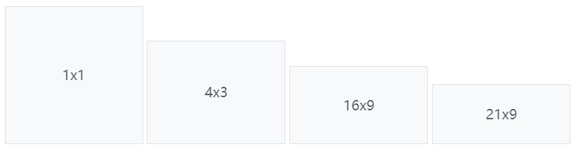
ratio设置 ratio 父容器ratio-1x1父容器的比率为 1:1,子容器会响应式的适应父容器ratio-4x3ratio-16x9ratio-21x9
html
<div class="ratio ratio-1x1">
	<iframe src="//player.bilibili.com/player.html?aid=1951552392&bvid=BV12C411a7eV&cid=1468271866&p=1"
		scrolling="no" border="0" frameborder="no" framespacing="0" allowfullscreen="true"> </iframe>
</div>
display
d-none隐藏元素,在任何屏幕尺寸下都不可见d-md-block中等屏幕尺寸及以上时显示元素,而在较小的屏幕尺寸下隐藏元素d-md-flexdisplay-middle-flex,表示当屏幕宽度达到中等及以上时,设置弹性容器
position
💛 高度/宽度
.w-*宽度,*表示百分之多少.h-*高度
.fixed-top相对于视口将元素定位在顶上.fixed-bottom相对于视口将元素定位在底部.sticky-top根据用户滚动位置,将元素定位在顶上sticky-sm-top当视口是 sm 或更宽尺寸时,黏着在视口的顶部
.sticky-bottom
float
.float-start使元素向左浮动.float-end使元素向右浮动float-sm-end在小型屏幕或更宽的屏幕上向右浮动
Flexbox
.d-flex设置弹性容器.d-md-flex- ……

d-inline-flex创建行内弹性容器【内容多少占多少】
- 方向
.flex-column让其子元素垂直排列.flex-column-reverse让其子元素反向垂直排列.flex-row让其子元素水平排列.flex-row-reverse让其子元素反向水平排列
- 对齐
- 水平
- 水平对齐
justify-content-center子元素水平居中justify-content-md-end在中等以上屏幕宽度时将子元素水平右对齐justify-content-around在每个 flex 子项目的两侧都添加空间justify-content-between第一个 flex 子项目的左侧不添加空间,最后一个 flex 子项目的右侧不添加空间,其他都类似around
- 自我水平对齐
mx-auto居中ms-auto居右对齐me-auto居左对齐
- 水平对齐
- 垂直
- 单行时的垂直对齐
.align-items-start.align-items-end.align-items-center.align-items-baseline.align-items-stretch【默认】
- 多行时的垂直对齐
.align-content-end堆叠到下面.align-content-center堆叠到中间.align-content-between平均堆叠,上下无空间.align-content-around平均堆叠,上下有空间.align-content-stretch拉伸平均堆叠满父容器
- 自我垂直对齐【用于 flex 子项目,会覆盖父容器的垂直对齐】
.align-self-start.align-self-end.align-self-center.align-self-baseline.align-self-stretch【默认】mt-auto让元素居下mb-auto让元素居上
- 单行时的垂直对齐
- 水平
html
<div class="d-flex">
	<div class="p-2 bg-info">弹性项目 1</div>
	<div class="p-2 bg-warning ms-auto">弹性项目 2</div>
	<div class="p-2 bg-primary">弹性项目 3</div>
</div>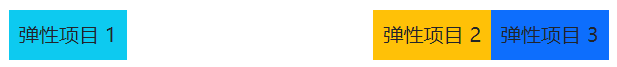
- 占比
.flex-fill强制拉伸能拉伸到的最大宽度.flex-shrink-*.flex-shrink-1如果空间不足,项目将会缩小【默认】.flex-shrink-0无论空间是否充足,这个项目都不会缩小
.flex-grow-*.flex-grow-0即使存在剩余空间,项目也不会增大【默认】.flex-grow-1占用比例为 1 的剩余空间
html
<div class="d-flex">
	<div class="p-2 bg-info flex-fill">弹性项目 1</div>
	<div class="p-2 bg-warning flex-fill">弹性项目 2</div>
	<div class="p-2 bg-primary flex-fill">弹性项目 3</div>
</div>- 换行【默认不换行】
.flex-wrap对 flex 子项目进行换行