占位符
为组件或页面使用加载占位符,以显示某些内容仍在加载中
表单
在 BootStrap 中,最好把所有的表单字段都包含在 <form> 标签中
通用表单属性
disabled禁用readonly只读
html
// 禁用
<form>
  <fieldset disabled>
    <legend>Disabled fieldset example</legend>
    <div class="mb-3">
      <label for="disabledTextInput" class="form-label">Disabled input</label>
      <input type="text" id="disabledTextInput" class="form-control" placeholder="Disabled input">
    </div>
    ……
    </div>
    <button type="submit" class="btn btn-primary">Submit</button>
  </fieldset>
</form>
表单布局
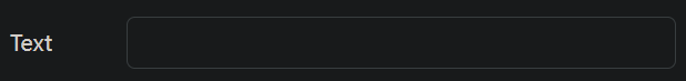
表单标签与表单输入同行
<label>要添加.col-form-label,使得标签与输入垂直居中
html
<div class="d-flex">
	<label for="text1" class="col-form-label">注:*为必填内容:</label>
	<form action="">
		<input type="text" class="form-control" id="text1" placeholder="今天是:2024年4月12日 星期五 22:55">
	</form>
</div>
[!hint]
<label>还可以使用.col-form-label-sm/lg,来匹配<input>的大小
<input>
在
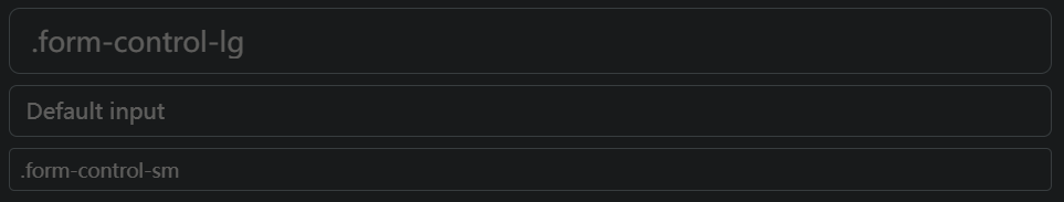
<input>标签中添加form-control
- 类型
text单行输入字段password密码字段radio单选按钮checkbox复选框file文件上传date日期time时间month月份,年份week周,年color颜色range一个范围datetime-local日期+时间number数字输入框email邮件输入框hidden隐藏域按钮submit提交按钮reset重置按钮【重置表单数据】button可点击按钮
- 大小
form-control-lg- 默认
form-control-sm
html
// placeholder表示占位符
<input class="form-control form-control-lg" type="text" placeholder=".form-control-lg">
<input class="form-control" type="text" placeholder="Default input">
<input class="form-control form-control-sm" type="text" placeholder=".form-control-sm">
file
[!hint] 使用
multiple属性,一次上传多个文件html\<label for="formFileMultiple" class="form-label">Multiple files input example\</label> \<input class="form-control" type="file" id="formFileMultiple" multiple>
color
[!hint] 使用
.form-control-color,优化颜色表单html\<input class="form-control form-control-color" type="color">
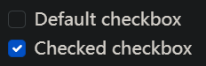
radio,checkbox
[!hint] 使用
.form-check/.form-check-inline,优化单选框,复选框html\<div class="form-check"> \<input class="form-check-input" type="radio" name="flexRadioDefault" id="flexRadioDefault1"> \<label class="form-check-label" for="flexRadioDefault1"> Default radio \</label> \</div> \<div class="form-check"> \<input class="form-check-input" type="radio" name="flexRadioDefault" id="flexRadioDefault2" checked> \<label class="form-check-label" for="flexRadioDefault2"> Default checked radio \</label> \</div>html// 复选框 \<div class="form-check"> \<input class="form-check-input" name="check1" type="checkbox" value="" id="flexCheckDefault"> \<label class="form-check-label" for="flexCheckDefault"> Default checkbox \</label> \</div> \<div class="form-check"> \<input class="form-check-input" name="check1" type="checkbox" value="" id="flexCheckChecked" checked> \<label class="form-check-label" for="flexCheckChecked"> Checked checkbox \</label> \</div>
.form-check-inline同级单复选框水平堆叠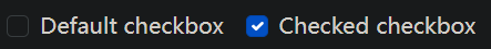
html
<div class="form-check form-check-inline">
<input class="form-check-input" name="check1" type="checkbox" value="" id="flexCheckDefault">
<label class="form-check-label" for="flexCheckDefault">
Default checkbox
</label>
</div>
<div class="form-check form-check-inline">
<input class="form-check-input" name="check1" type="checkbox" value="" id="flexCheckChecked" checked>
<label class="form-check-label" for="flexCheckChecked">
Checked checkbox
</label>
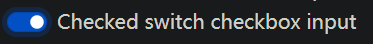
</div>[!hint] 复选框的开关样式
html\<div class="form-check form-switch"> \<input class="form-check-input" type="checkbox" id="flexSwitchCheckChecked" checked> \<label class="form-check-label" for="flexSwitchCheckChecked">switch checkbox\</label> \</div>
range
使用
.form-range来优化范围表单
- 步长
step="0.5"如果是 0-5,那将滑动 10 次
html
<label for="customRange1" class="form-label">Example range</label>
<input type="range" class="form-range" id="customRange1" min="0" max="5" step="0.5">
<textarea>
- 默认行数
rows="数值"
html
<div>
  <label for="exampleFormControlTextarea1" class="form-label">Example textarea</label>
  <textarea class="form-control" id="exampleFormControlTextarea1" rows="3"></textarea>
</div>
下拉表单 <select>
在
<select>标签上使用.form-select
- 预选
selected
html
<select class="form-select">
  <option selected>Open this select menu</option>
  <option value="1">One</option>
  <option value="2">Two</option>
</select>- 大小
.form-select-lg- 默认
.form-select-sm
- 每页的个数
size="数值"
html
// 一次只显示一个选项
<select class="form-select" size="1">
  <option selected>Open this select menu</option>
  <option value="1">One</option>
  <option value="2">Two</option>
</select>- 多重属性
multiple
html
<select class="form-select" multiple>
  <option selected>Open this select menu</option>
  <option value="1">One</option>
  <option value="2">Two</option>
</select>
表单组
表单组可以让某几个元素成为一个整体
- 实现表单两侧固定文字
- 实现表单与按钮的无违和感结合
.input-group创建一个表单组.input-group-text在里面放置固定文字
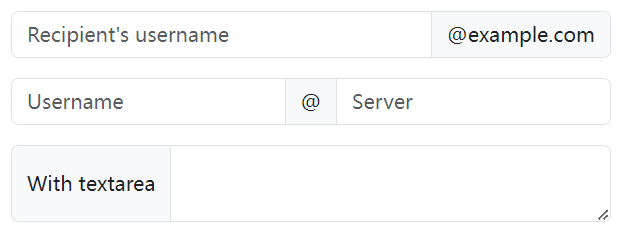
html
<div class="input-group mb-3">
  <input type="text" class="form-control" placeholder="Recipient's username">
  <span class="input-group-text" id="basic-addon2">@example.com</span>
</div>

<div class="input-group mb-3">
  <input type="text" class="form-control" placeholder="Username">
  <span class="input-group-text">@</span>
  <input type="text" class="form-control" placeholder="Server">
</div>

<div class="input-group">
  <span class="input-group-text">With textarea</span>
  <textarea class="form-control" aria-label="With textarea"></textarea>
</div>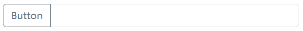
html
<div class="input-group mb-3">
	<button class="btn btn-outline-secondary" type="button" id="button-addon1">Button</button>
	<input type="text" class="form-control" placeholder="">
</div>
表单浮动标签
在单击输入字段有值/获取到焦点时,使标签浮动
使用前提
- <label> 元素必须在 <input> 元素之后
- 每个 <input> 元素都必须有
placeholder属性
不支持 下拉表单的多重选择
输入字段的反馈应放在 `.form-floating` 之外,`.input-group` 之内
html
\<div class="input-group has-validation">
  \<div class="form-floating is-invalid">
    \<input type="text" class="form-control is-invalid" id="floatingInputGroup2" placeholder="Username" required>
    \<label for="floatingInputGroup2">Username\</label>
  \</div>

  \<div class="invalid-feedback">
    Please choose a username.
  \</div>
\</div>
html
<div class="form-floating mb-3">
  <input type="email" class="form-control" id="floatingInput" placeholder="name@example.com">
  <label for="floatingInput">Email address</label>
</div>

<div class="form-floating">
  <input type="password" class="form-control" id="floatingPassword" placeholder="Password">
  <label for="floatingPassword">Password</label>
</div>
表单验证
- 用
<form>包起来 - 设置按钮
type="submit"
html
<form>
	<div class="row mb-2">
		<div class="col-12 d-flex">
			<label for="validationDefault01"
				class="form-label col-form-label flex-shrink-0">地点名称:</label>
			<input type="text" class="form-control" id="validationDefault01" required>
		</div>
	</div>
</form>

<button class="btn btn-primary d-block mx-auto px-4" type="submit">搜索</button>